The Tale of Two Charts
Published: 07/22/2014 09:29 p.m.
Here is a snapshot of my github public profile. This was taken July 22, 2014. Though it is not visible, the highest single day (dark green) was 9 contributions.
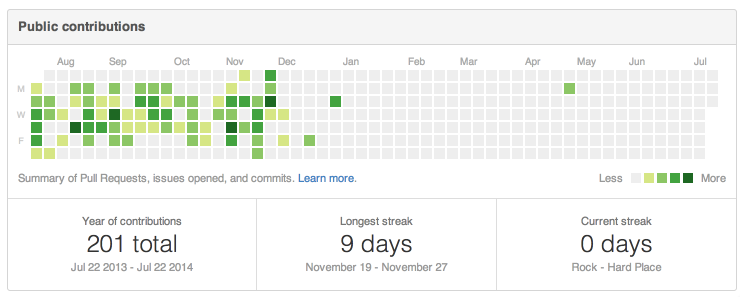
201 total, with a long streak of 9 days. Looks like I fell off the face of the earth in December. That's not actually what happened.
Below is a chart that mixes my public and private github contributions. This was taken July 22, 2014, same as the other. The highest single day (dark green) was 25.
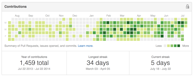
A whopping 1,459 total contributions, with a high streak of 34 days (almost the entire month of March). This chart includes both public and private contributions, so only private was a total of 1,258. The public contributions from July 2013 to December are a much lighter shade of green (less by comparison), but the data is unchanged.
What does this prove? That "open always wins" is wrong? That closed source increases productivity 6x? That 2014 is the year of coding? That I don't (or no longer) believe in Open?
No, this doesn't prove any of that. Commits are a very poor way to measure productivity, though they are easy to count. Days-in-a-row streaks might highlight too little work, or too much, but again, it only measures the number of contributions and is easily gamed. And what someone believes in is not reflected in a graph of contributions from the last 365 days.
The only thing these charts prove is that in the last 6 months, I've made about 6 times as many contributions as the 6 months before.
While the first chart includes only public, and the second public and private, I should note that all but 25 of these contributions were paid. The rest were for small side projects of mine. I use and encourage the use of open source software every day, but I don't claim to be a free contributor to it.